
Discover Your True Color Harmony & See Yourself in 900+ Colors

Why Color Analysis
Color analysis has made a big comeback since its original rise in the 70s and 80s, drawing in a new wave of people curious to discover “their colors.” And yet, many still haven’t heard of it. But even without knowing the term, most of us have noticed: some colors make a person glow, others make them fade.
At its core, color analysis is about finding colors that align with your natural coloring—your skin, eyes, lips, and sometimes hair. It asks: which colors support what’s already there, rather than compete with it? And there are many methodologies to achieve it. Let's explore!
What Makes Qolord Different?
-

When the Theory Didn’t Add Up
As I started developing this dream, I thought I’d map the colorful clothes to the seasonal analysis system. But the deeper I went, the more confusing it got. Every color analysis system had its own logic, and their palettes looked quite different—even when they were supposedly based on the same theories. I tried multiple times to figure out the logic behind which colors fit which season, but never found a clear answer.
So I decided to start again. From scratch.
-

Finding Your Harmony Through the Science of Color
I turned to the science of color itself—focusing on chroma (intensity), lightness (value), and hue (color family around the wheel, like red, yellow, or green). These characteristics exist in every color we see. And when it comes to people, our skin, lips, eyes, and even hair all carry their own unique mix of those traits.
Together, they blend into a kind of color harmony. That harmony can be muted and low-contrast, or bright and high-contrast. It can be warm or cool, light or deep. The goal of color analysis is to find your harmony—and pinpoint where it sits on the color wheel.
-

Organizing the Color Wheel into Color Groups
I spent last years observing already-analyzed people from the 16-season system. I experimented with structuring color wheel in different ways to create color groups. Too many colors can feel overwhelming and impractical when differences between them are hard to distinguish—too few color groups, and some people’s best colors get left out.
Eventually, I landed on a system of 933 colors, divided into multiple color groups. Each one mapped by shared properties or color characteristics.


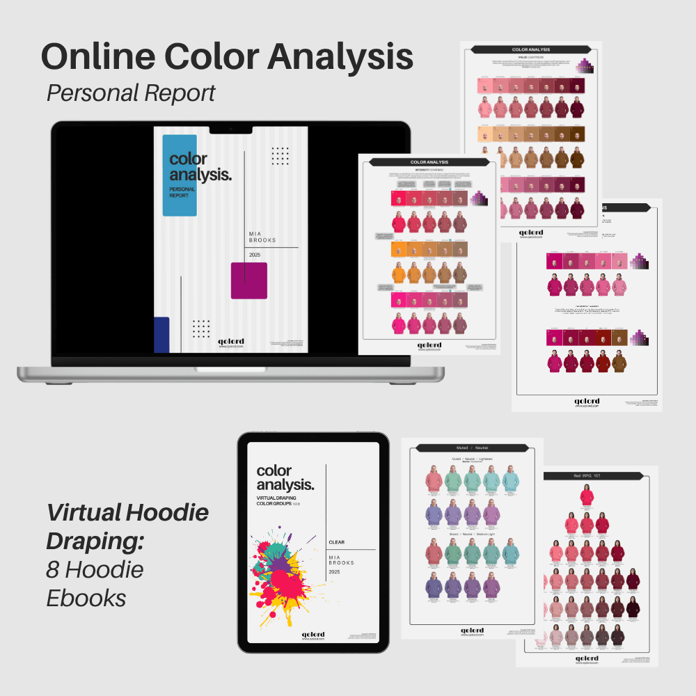
What You'll Get with Your Online Color Analysis
Part 1
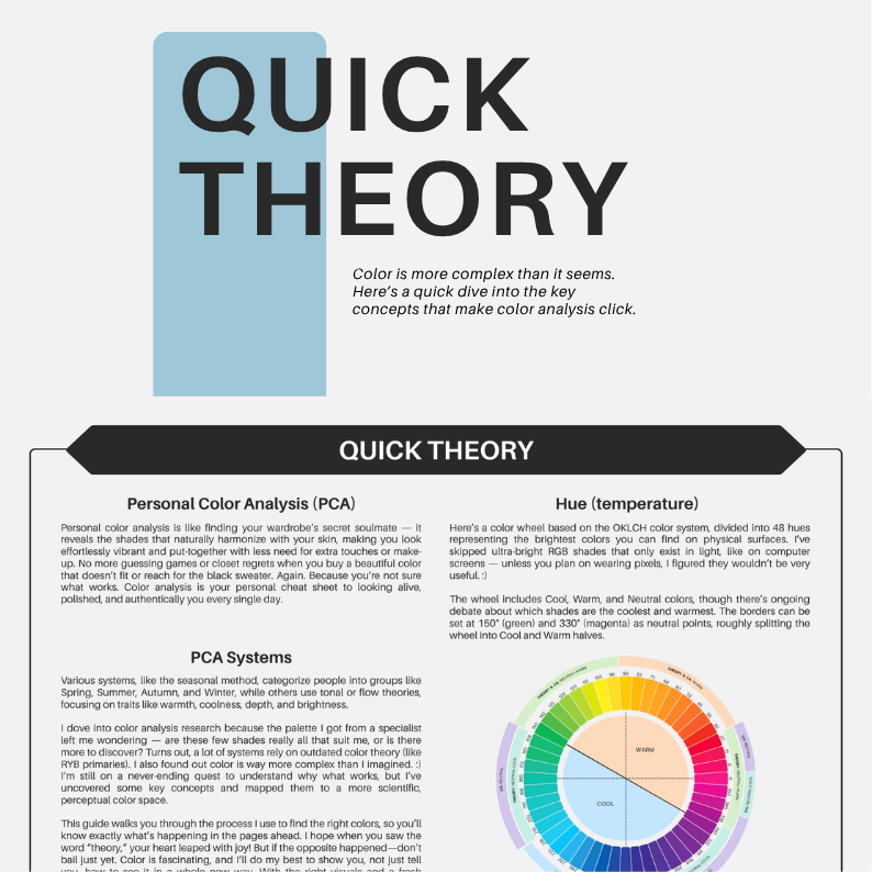
Quick Theory
Before your analysis, you'll get a compact, visually-rich 3-page introduction to the Qolord color system. It gives you a clear understanding of how the system works, what influences your color harmony, and how to interpret your results. You'll see how the color groups are built, how colors are organized in the system, and the essential color theory behind it — designed to help you make sense of your palette.
You won’t just receive color palettes—you’ll gain insight into why these colors work for you. I want to share knowledge that stays with you for life, not just deliver quick results.
Part 2
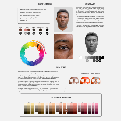
Skin Tone Analysis
Skin, eyes, lips, and hair all give valuable clues—but analyzing just a few pixels isn’t enough to define your colors or season. I’ll look at your feature colors and how they sit on the color wheel, the contrast between your features, and the proportion of red or yellow pigments.
Your edited face pigments are also run through a program that calculates the average—so you can see a clear visual of how warm or cool your skin tone appears. While this isn’t an exact science (digital images aren’t perfect), it gives a strong sense of direction. If your skin is very warm, for example, that warmth usually comes through clearly—even if there’s a slight shift or inaccuracy in white balance adjustment.
Part 3
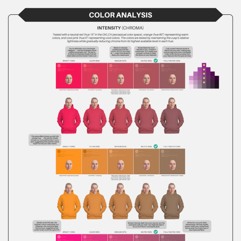
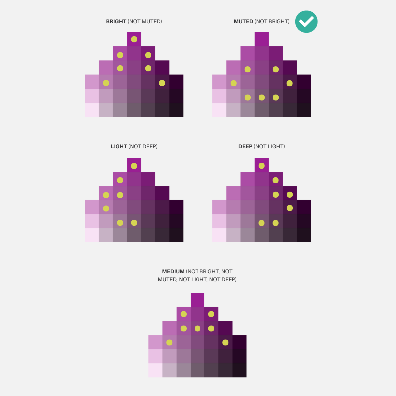
Intensity (Chroma) Test
I start with an intensity (chroma) test. While most analyses begin by comparing warm and cool tones, I find that chroma—whether you lean bright, medium, or muted—offers a faster, clearer insight into your natural harmony. It creates a solid foundation to understand your characteristics. Chroma is also the easiest quality to spot visually. Checking temperature or value in the wrong brightness can be misleading, so we begin with intensity first. After that, we explore colors close to your identified chroma level.
All tests are done using both color rectangles with only your face and virtually draped hoodies. The intensity test includes colors across different temperatures to give you a broader impression right from the start.
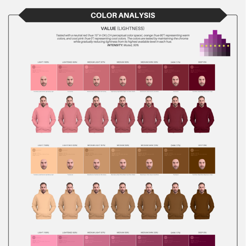
Part 4
Value (Lightness) Test
Once I determine the intensity that suits you best, I move on to value (lightness) testing. This is done using colors in the exact same intensity, because lightness can look very different depending on chroma—both in contrast and overall impression.
Here, we figure out whether you lean more light, deep, or somewhere in between. Sometimes it's obvious—light shades can wash you out or feel clownish, while deep tones may overwhelm you. Other times, both extremes feel off, pointing to a more balanced value range. This step offers more clarity about your unique color characteristics.
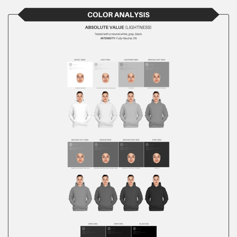
Part 5
Absolute Lightness Test
Through extensive testing, I developed a color system where each hue is structured relative to the others. It’s a complex structure, but here’s what matters for your analysis: absolute lightness can appear very different depending on the hue. For instance, the same lightness value might look pastel in indigo blue but muddy and dark in lemon yellow.
Still, absolute lightness is a helpful tool—it reveals which lightness range suits you best. Once your ideal lightness range is identified, it becomes much easier to navigate various hues and find tones that truly work for you.
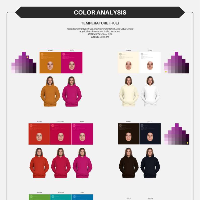
Part 6
Temperature (Hue) Test
Now that intensity and value have been established, we move on to testing temperature (hue). The colors used here are selected to match the chroma and value revealed in earlier steps. This test shows whether very warm oranges, very cool pinks, or more neutral tones suit you best. If both warm and cool tones feel off, it’s likely you wear more neutral colors well.
This stage offers an initial insight into your temperature—whether you lean warm, cool, or sit in the middle. Later, we’ll test a wide range of hues independently of temperature to refine the picture even further.
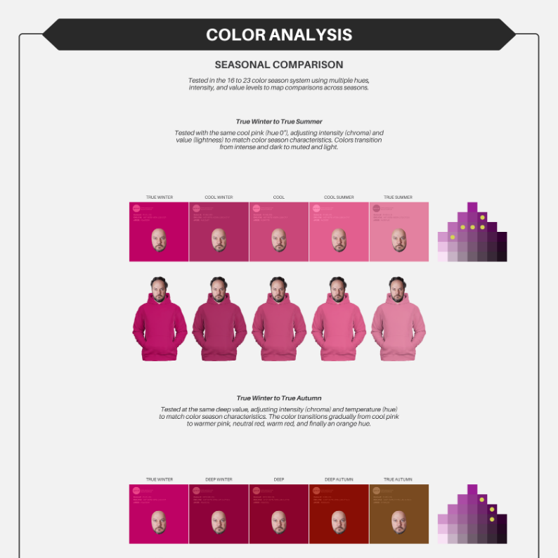
Part 7
Seasonal Comparison
Now that the individual tests are complete, we go even deeper. This stage brings together color tones that vary in chroma, lightness, and temperature. I've curated tones that represent each seasonal flow, such as all cool seasons spanning from True Winter to True Summer, including Cool Winter and Cool Summer in between, or deep tones from True Winter to True Autumn with Deep Winter and Deep Autumn in between.
This step also acts as a cross-check, helping confirm whether all previous test results align. It’s also where lingering uncertainty between two or three color groups often becomes clear.
Part 8
Closest Color Comparison Across 24 Hues Around the Color Wheel
From the previous tests, we’ve gained a clear sense of which color groups might suit you—and which definitely don’t. For each person, it’s usually clear if they are definitely not muted—in that case, we focus on bright to medium groups. Or if they are clearly not bright, we test muted to medium groups instead. The same goes for light or deep. If none of these extremes fit, we explore all the medium groups to find the best match.
This is the final and most interesting test. Based on all previous steps, we now go through 24 hues evenly spaced around the color wheel. Instead of just comparing 3 test hues, we look at every hue and see how it works specifically on you—beyond just warm or cool, season names, or general groupings. Everyone has unique skin, eye, lip, and hair tones—this step helps refine your unique colors.
Part 9
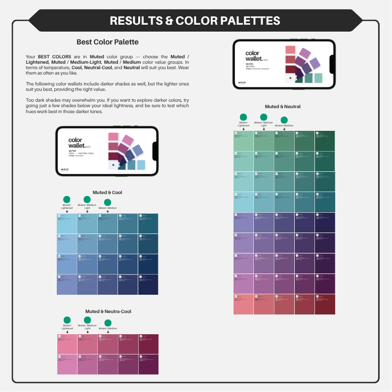
Results and Color Palettes — organized, labeled, and ready to be explored
I won’t give you 30 or 40 hand-picked colors. While some people want a custom selection, I found those systems limiting. What I missed in most color analysis methods was a clear structure and freedom to choose. That’s what I aim to offer you—an understanding of how colors work, where they sit on the color wheel, and how to interact with them.
When you shop and see a new color, you shouldn’t have to guess by holding up a palette. Instead, if you understand your best lightness, chroma, and hue, you’ll know whether a tone is ideal, close, or off. That’s the goal of the palette and results pages: to combine your test results so you can explore what works best for you.
Exclusive Virtual Draping in 900+ Hoodie Colors — Explore the Full Color Wheel
Why Just Guess, When You Can See?
Comparison is the only real way to see what flatters and what distorts. You’ll see hundreds of colors draped on you, grouped by clear structure.
The colors are organized by both Qolord color groups and 48 hues, so you can clearly see the difference between light vs. dark, bright vs. muted, heavy vs. soft. Every color name and group is labeled, with clickable links to shop the exact hoodie colors or groups directly in the Qolord store.
You finally get to see where you belong on the color wheel. You don’t have to believe anyone — now, you can actually see. You don’t just get answers — you get tools to learn yourself.
The Hoodie Ebooks by Color Groups: See All Your Best Colors in One Place
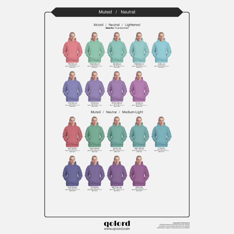
The Hoodie Ebooks (Color Group version) show your virtual draping results organized into 5 Qolord groups: Clear, Medium, Muted, Fully-Muted, and Neutral. Each ebook displays warm, neutral-warm, neutral, neutral-cool, and cool tones across every group—so you can compare colors that share similar characteristics.
Your best group will be marked from your online color analysis, but you’ll have the full view to explore nearby options too.
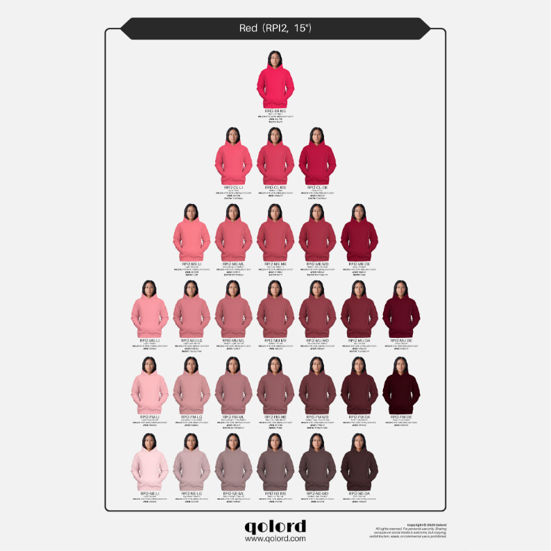
The Hue Hoodie Ebook: One Color Family at a Time
The Hoodie Ebook (Hue version) shows your virtual draping results in all 48 hues of the full Qolord color system—covering the entire color wheel. Each page includes grouped hoodie images by hue, lightness and chroma.
Each page gives you one hue at a time — all shades and variations laid out to compare. You’ll see where colors become too strong, too dull, too heavy, or just right. It’s a hands-on tool that puts the power in your hands. No more decoding vague palettes. You’ll explore yourself what feels like you.
Real People, Real Transformation
Your Journey Starts Here. Ready?
| Hoodie E-Books | Online Color Analysis | Bundle: Online Color Analysis + Hoodie Ebooks | |
|---|---|---|---|
| White Balanced Photo | ✔ | ✔ | ✔ |
| Personalized comments | ✔ | ✔ | |
| 5 Hoodie Ebooks (color groups) | ✔ | ✔ | |
| 1 Hoodie Ebook (hues) | ✔ | ✔ | |
| Skin Tone Test | ✔ | ✔ | |
| Intensity Test | ✔ | ✔ | |
| Value Test | ✔ | ✔ | |
| Absolute Value Test | ✔ | ✔ | |
| Temperature Test | ✔ | ✔ | |
| Seasonal Comparison Test | ✔ | ✔ | |
| Closest Color Comparison Test | ✔ | ✔ | |
| Color Analysis Results | ✔ | ✔ | |
| Best Color Palette | ✔ | ✔ | |
| Neutral Color Palette | ✔ | ✔ |